
Aesthetic Fonts Guide: Cottagecore, Y2K, Soft Girl & More
Introduction
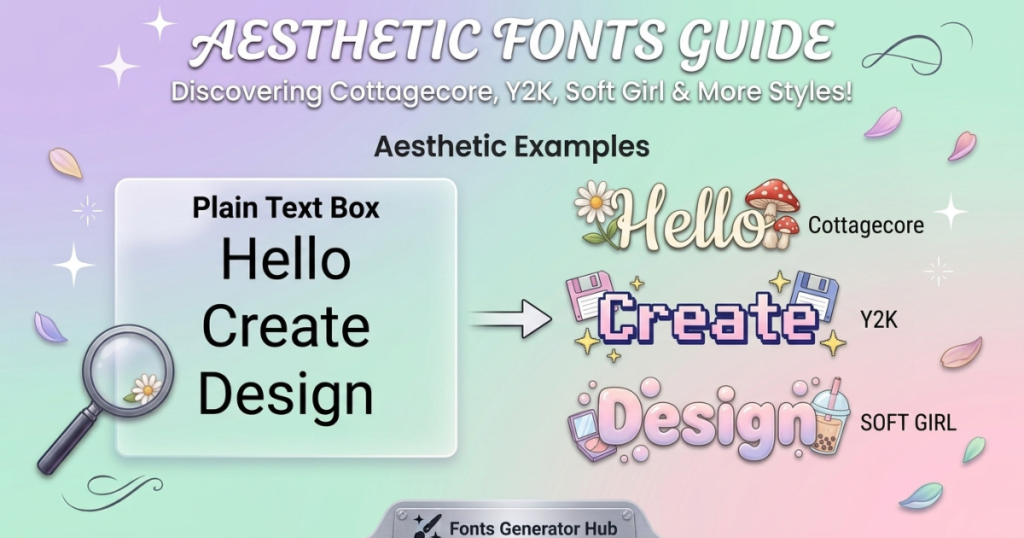
“Aesthetic” isn’t one font — it’s a mood. Cottagecore feels soft and vintage; Y2K feels bold and retro-futuristic; soft girl feels delicate and dreamy. The right aesthetic font instantly signals your vibe, whether it’s an Instagram bio, a username, or a poster. This guide breaks down every major aesthetic — what makes each one feel the way it does, example styles, and how to use them — all copy-paste ready.
What Are Aesthetic Fonts?
Aesthetic fonts are text styles chosen to create a specific mood or vibe rather than just to be readable. They’re less about one letter shape and more about the feeling they evoke — cozy, futuristic, delicate, scholarly, edgy.
Found your aesthetic? Now get the words to match — browse our 200+ aesthetic bio ideas sorted by vibe and platform.
What Makes a Font Feel “Aesthetic”?
A font feels aesthetic when its style matches a recognizable visual trend — soft script for dreamy vibes, wide retro text for Y2K, elegant serifs for academia. It’s the association that makes it aesthetic, not the font alone.
Why Font Choice Affects the Mood of Text
Typography carries emotion. The same word in flowing cursive vs. bold blocky letters feels completely different — one soft, one strong. Your font choice sets the tone before anyone reads a single word.
Aesthetic Fonts vs Regular Fonts
A regular font (Arial, Times) is neutral — it just displays text. An aesthetic font (or copy-paste aesthetic Unicode style) is chosen to express something. On social media, you create these looks with Unicode characters, since apps don’t let you install fonts. (See how fancy fonts work.)
How to Choose a Font for Your Aesthetic
- Match the font to the mood — soft script for cottagecore/soft girl, wide bold for Y2K, serif for academia.
- Consider readability — the prettiest style is useless if people can’t read it. Balance vibe with legibility.
- Choose based on where you’ll use it — a bio needs readability; a poster can be more decorative.
- Don’t mix too many styles — one or two aesthetic styles max; more looks messy.
Cottagecore Fonts
What Makes a Font Feel Cottagecore?
Cottagecore is soft, vintage, handwritten, and rustic — think countryside cottages, wildflowers, and storybooks. The fonts feel warm and hand-drawn.
- Characteristics: soft curves, vintage warmth, hand-drawn or serif letterforms, a cozy storybook feel
- Styles: serif and handwritten styles work best
- When to use: lifestyle accounts, nature/garden themes, cozy/vintage brands, journaling
Cottagecore Font Examples
- Script/italic: 𝓌𝒾𝓁𝒹𝒻𝓁ℴ𝓌ℯ𝓇 ✿
- Serif-style: 𝕮𝖔𝖙𝖙𝖆𝖌𝖊 ❀
- With natural symbols: ❀ 𝒸ℴ𝓏𝓎 𝒹𝒶𝓎𝓈 🌿
(For design projects, free Google Fonts like Sorts Mill Goudy, Amatic SC, IM Fell English, and Cardo capture the cottagecore feel — but for bios/social, the copy-paste styles above are the way.)
Y2K Fonts
What Makes a Font Feel Y2K?
Y2K draws from late-’90s/early-2000s retro-futurism — digital, chrome, bubbly, and bold. It feels playful, nostalgic, and techy.
- Characteristics: wide, rounded, bold, bubble, chrome, or techno-inspired
- Styles: fullwidth text, bubble letters, bold outlines, glitchy retro sets
- When to use: retro/nostalgic content, playful profiles, music, fashion with a 2000s vibe
Y2K Font Examples
- Fullwidth/wide: Y2K vibes
- Bubble: Ⓡⓔⓣⓡⓞ
- Bold: 𝗖𝗬𝗕𝗘𝗥 ✧
Soft Girl Fonts
What Makes a Font Feel Soft Girl?
Soft girl is delicate, feminine, playful, and dreamy — gentle and intentional, with a light, airy feel.
- Characteristics: delicate, feminine, rounded, light
- Styles: cursive, script, rounded, light styles with soft symbols
- When to use: feminine lifestyle, beauty, dreamy/pastel aesthetics
Soft Girl Font Examples
- Cursive: 𝓈ℴ𝒻𝓉 𝑔𝒾𝓇𝓁 ♡
- With dreamy symbols: ☁️ 𝒹𝓇ℯ𝒶𝓂𝓎 ⋆。˚
- Light + hearts: ♡ 𝒶𝓃𝑔ℯ𝓁 ♡
Other Popular Aesthetic Font Styles
- Coquette — soft, flirty, bows and ribbons (🎀 cursive): 🎀 𝒸ℴ𝓆𝓊ℯ𝓉𝓉ℯ 🎀
- Dark Academia — scholarly, gothic, vintage (serif/fraktur): 𝔞𝔠𝔞𝔡𝔢𝔪𝔦𝔞 📚
- Light Academia — softer academia, warm and bright (clean serif): 𝒶𝒸𝒶𝒹ℯ𝓂𝒾𝒶 ☀️
- Gothic — dramatic, dark, ornate (blackletter): 𝔤𝔬𝔱𝔥𝔦𝔠
- Minimalist — clean, simple, modern (small caps/sans): ᴍɪɴɪᴍᴀʟ
- Vintage — old-fashioned, nostalgic (serif): 𝖁𝖎𝖓𝖙𝖆𝖌𝖊
- Retro — throwback, bold, funky (bubble/wide): Retro
- Fairycore — whimsical, magical, nature-fae (script + sparkles): ✧ 𝒻𝒶𝒾𝓇𝓎 ✧
- Clean Girl — polished, effortless, minimal (small caps): ᴄʟᴇᴀɴ ɢɪʀʟ
- Grunge — edgy, distressed, rebellious (glitch/strikethrough): g̷r̷u̷n̷g̷e̷
Aesthetic Font Style Comparison
| Aesthetic | Font Characteristics | Overall Feel |
|---|---|---|
| Cottagecore | Handwritten, serif, vintage | Rustic, cozy |
| Y2K | Bold, futuristic, rounded | Retro, playful |
| Soft Girl | Script, cursive, delicate | Soft, feminine |
| Coquette | Cursive + bows/ribbons | Flirty, sweet |
| Dark Academia | Serif, fraktur, classic | Scholarly, vintage |
| Gothic | Blackletter, ornate | Dramatic, dark |
| Minimalist | Clean, simple | Modern, understated |
| Grunge | Distressed, rough | Edgy, rebellious |
Can You Use Aesthetic Fonts on Social Media?
Yes — aesthetic Unicode fonts work across:
- Instagram bios — the most popular use (see our best fonts for Instagram bios guide)
- Captions — style a line or heading
- TikTok bios — aesthetic styles are hugely popular here
- Facebook — posts, bios, comments
- Usernames — in display names (not the @handle, which needs plain text — see Unicode text in usernames)
- Posts and profile descriptions
They’re standard Unicode, so they paste and display across platforms.
Aesthetic Fonts vs Actual Fonts
Three different things people mix up:
- Downloadable fonts — font files (TTF/OTF) you install and use in design software (Canva, Photoshop). For graphics, not pasteable text.
- Fonts in design software — chosen within a program; control the exact look of a design.
- Unicode-based fancy text — copy-paste characters that work in bios, usernames, and captions without installing anything.
For a poster or printed invitation, use a downloadable aesthetic font in a design tool. For a bio, username, or caption, use copy-paste Unicode aesthetic text (what our tools make).
How to Create Aesthetic Text With a Font Generator
- Enter your text in a generator — like our aesthetic font generator.
- Browse the styles available.
- Choose one matching your aesthetic (cottagecore script, Y2K wide, soft girl cursive).
- Copy the result.
- Paste it where you want to use it.
- Check readability and compatibility before saving.
How to Mix Aesthetic Fonts Without Making Text Look Messy
- Combine one decorative style with a simple style — e.g., cursive name + plain details.
- Use different styles for headings and supporting text — not the same decoration everywhere.
- Avoid combining several highly decorative fonts — it turns to visual noise.
- Keep important information readable — contact, links, and key info in clear text.
Why Some Aesthetic Fonts Look Different on Different Devices
The same aesthetic text can look different (or show as boxes) across devices because:
- Unicode character support varies by device
- Font availability differs (each device draws characters with its own fonts)
- Missing characters show as boxes (□) when a device lacks the glyph
- Different rendering systems (iPhone vs Android vs Windows)
- Platform differences in how text is processed
Stick to common styles for reliability. (Full detail: why fancy text shows as boxes.)
How to Choose the Right Aesthetic Font for Your Content
- For Instagram bios — readable aesthetic styles (cursive, small caps) on your name/first line
- For usernames — simpler aesthetic styles that fit display-name rules
- For captions — a styled heading + plain body text
- For digital invitations — decorative is fine (it’s a one-off visual)
- For posters and graphics — use a downloadable aesthetic font in a design tool for full control
- For branding — readable, consistent, distinctive — avoid overly decorative
Common Aesthetic Font Mistakes
- Choosing style over readability
- Using too many decorative characters
- Using a style that doesn’t match the content’s mood
- Assuming every fancy character works everywhere (test first)
- Making an entire paragraph decorative (style selectively instead)
Frequently Asked Questions
What is an aesthetic font?
A text style chosen to create a specific mood or vibe (cottagecore, Y2K, soft girl, etc.) rather than just to be readable. On social media, these are copy-paste Unicode styles.
What are the top aesthetic fonts?
The most popular are cursive/script, wide/fullwidth, small caps, serif, and symbol-decorated text — matched to aesthetics like cottagecore, Y2K, soft girl, and dark academia.
What font is best for cottagecore?
Soft handwritten or serif styles — script Unicode with nature symbols (❀ 🌿) for social, or Google Fonts like Sorts Mill Goudy or Amatic SC for design.
What fonts look Y2K?
Wide/fullwidth text, bubble letters, and bold rounded styles — the retro-futuristic look of the early 2000s.
What fonts are good for a soft girl aesthetic?
Delicate cursive and script with soft symbols (♡ ☁️ ⋆) — light and feminine.
What is the best girly / cutest font?
Cursive and script styles with hearts and soft symbols are the girliest and cutest — try our cute font generator.
What font styles are popular for Instagram?
Cursive, small caps, bold, and aesthetic styles. See our best fonts for Instagram bios.
Can I copy and paste aesthetic fonts?
Yes — every style here is copy-paste Unicode. Generate, copy, and paste into any app.
Are aesthetic fonts actually fonts?
On social media, no — they’re Unicode characters that look styled, not installed fonts. Downloadable fonts (for design software) are a separate thing.
Why does aesthetic text look different on different devices?
Different devices draw Unicode characters with different fonts, so the look varies (or shows boxes on old devices). Common styles are most consistent.
Quick Aesthetic Font Cheat Sheet
| Your Aesthetic | Use This Style |
|---|---|
| Cottagecore | Script/serif + nature symbols (❀🌿) |
| Y2K | Fullwidth / bubble / bold |
| Soft Girl | Cursive + soft symbols (♡☁️) |
| Coquette | Cursive + bows (🎀) |
| Dark Academia | Serif / fraktur + 📚 |
| Gothic | Blackletter |
| Minimalist / Clean Girl | Small caps |
| Grunge | Glitch / strikethrough |
Conclusion
There’s no single “best” aesthetic font — the right one depends on your mood, purpose, readability, and platform. Match the style to the vibe (soft script for cottagecore, wide bold for Y2K, delicate cursive for soft girl), keep it readable, and use it selectively. Ready to create your look? Try our aesthetic font generator and find the style that matches your vibe.