
Cursive vs Calligraphy Fonts: What’s the Difference?
Cursive vs Calligraphy: Are cursive and calligraphy the same? No.
Here’s the key difference.
Cursive is about flowing, connected handwriting — letters that join as you write. Calligraphy is about deliberate, artistic letterforms — carefully drawn strokes with intentional thick-and-thin contrast and decorative styling. Cursive prioritizes flow; calligraphy prioritizes form.
The confusion is understandable, because the terms overlap — especially in font names, where “script,” “cursive,” and “calligraphy” are often used interchangeably. This guide clears it up: what each one actually is, how they differ, when to use which, and how they behave as copy-paste text (which matters if you’re styling a bio or username, not just designing).
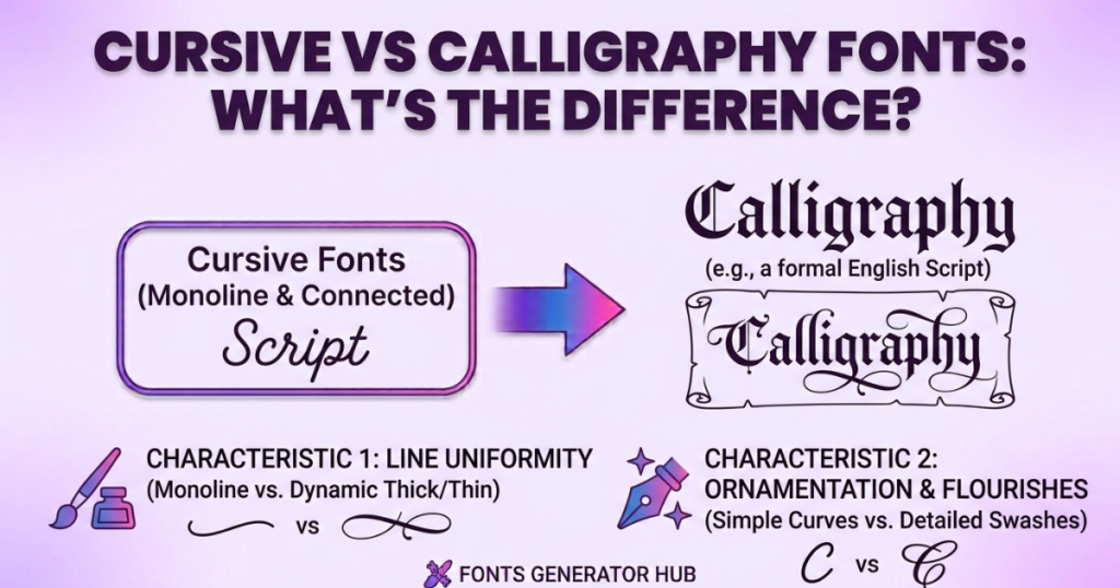
What Are Cursive Fonts?
Definition: cursive fonts imitate everyday joined-up handwriting — the kind you’d write quickly with a pen, where letters connect and flow into each other.
Typical characteristics:
- Letters are usually connected (or partially connected)
- A natural, handwritten rhythm
- Ranges from casual and relaxed to neat and elegant
- Generally consistent stroke width (like a normal pen)
Connected vs partially connected: true cursive joins most letters; some “cursive” fonts only connect some letters for a semi-cursive look that’s easier to read.
Common uses: personal signatures, invitations, greeting cards, social media graphics, quotes, and anywhere you want a warm, personal, handwritten feel.
Cursive works well when you want something that feels human and approachable — like a note written by hand.
What Are Calligraphy Fonts?
Definition: Calligraphy fonts are based on the art of beautiful writing — deliberate letterforms drawn with a technique (traditionally a broad-nib pen or brush) that creates dramatic thick-and-thin stroke contrast.
Characteristics:
- Deliberate, structured strokes (not casual)
- Pronounced thick downstrokes and thin upstrokes
- Often more decorative and ornamental
- May or may not connect letters (unlike cursive, connection isn’t the defining trait)
- A crafted, artistic quality
Different calligraphy styles include modern calligraphy, traditional/formal, brush, and copperplate-inspired — each with its own look.
Common uses: wedding invitations, logos, certificates, branding, formal announcements, and artistic prints.
Why calligraphy looks more decorative: because it comes from an art form, the emphasis is on beauty and craft — flourishes, stroke contrast, and elegant proportions — rather than the speed and flow of everyday writing.
Cursive vs Calligraphy Fonts: Key Differences
| Feature | Cursive Fonts | Calligraphy Fonts |
|---|---|---|
| Main appearance | Flowing / handwritten | Decorative / artistic |
| Letter connection | Often connected | May or may not connect |
| Stroke style | Fairly even width | Deliberate thick & thin contrast |
| Style range | Casual to elegant | Elegant to highly ornamental |
| Readability | Often easier for longer text | Varies — can be harder |
| Common uses | Invitations, signatures, social graphics | Weddings, logos, certificates, branding |
| Overall feel | Handwritten | Artistic / ornamental |
| Based on | Everyday handwriting | An art/lettering technique |
Are Cursive and Calligraphy Fonts the Same?
No — but people use the terms interchangeably for a reason. Both are flowing, elegant, and non-blocky, so casually they feel similar. The honest distinction: cursive describes how letters are written (connected, flowing handwriting), while calligraphy describes an artistic technique (deliberate, decorative letterforms).
Put simply: all calligraphy is beautiful lettering, but not all of it is cursive (some calligraphy has separate, non-joined letters). And cursive handwriting isn’t necessarily calligraphy (your quick handwritten note is cursive, but it’s not calligraphic art). They overlap in the middle — elegant connected scripts can be both — which is why the labels blur.
Types of Cursive Fonts
- Casual cursive — relaxed, everyday handwriting feel
- Elegant cursive — refined and graceful, for formal touches
- Brush-style cursive — mimics a brush pen, with some stroke variation
- Handwritten cursive — natural, imperfect, personal
- Script-style cursive — polished, font-like joined lettering
Types of Calligraphy Fonts
- Modern calligraphy — trendy, slightly irregular, artistic
- Traditional calligraphy — classic, formal, structured
- Brush calligraphy — bold strokes with strong thick-thin contrast
- Copperplate-inspired — fine, elegant, steep-angled classic style
- Blackletter / Gothic — dense, medieval, dramatic
- Decorative calligraphy — heavy flourishes and ornamentation
Cursive vs Script vs Calligraphy
People often search all three together — here’s how they relate:
| Type | Main characteristic | Typical use |
|---|---|---|
| Cursive | Flowing, connected handwriting | Personal, warm designs |
| Script | A font category imitating handwriting or lettering | Invitations, branding |
| Calligraphy | Deliberate, decorative art lettering | Formal, artistic designs |
The key insight: “script” is the broad umbrella category of fonts that look like handwriting or hand-lettering. Cursive and calligraphy are both types of script. So “is cursive a script?” — yes, cursive is one kind of script font; calligraphy is another. Script is the parent; cursive and calligraphy are children.
Which Is Easier to Read?
Honestly, readability depends on the specific font, not simply whether it’s cursive or calligraphic. A clean modern cursive is very readable; an ornate copperplate calligraphy with heavy flourishes is not. As a general rule, cursive tends to be more readable for longer text (it’s based on functional handwriting), while calligraphy can be harder when it’s highly decorative (it’s based on art, not speed). But there are readable calligraphy fonts and hard-to-read cursive ones — always judge the individual font.
Which Font Should You Use?
Rather than “which is better,” match the style to the purpose:
- Wedding invitations → calligraphy (elegant, formal, memorable)
- Logos & branding → calligraphy or polished script (distinctive, crafted)
- Social media posts & bios → cursive or script (readable, warm, on-trend)
- Signatures → cursive (personal, flowing)
- Certificates & formal documents → calligraphy (authoritative, ceremonial)
- Posters → depends on the vibe — calligraphy for elegant, cursive for friendly
- Children’s designs → casual cursive (approachable, easy to read)
- Long paragraphs → cursive (or honestly, a simpler font — neither is ideal for body text)
The golden rule: the more formal and artistic the occasion, the more calligraphy fits; the more personal and casual, the more cursive fits.
Cursive & Calligraphy Fonts for Digital Designs
How they behave across common tools:
- Canva — both work well; you can use built-in script/calligraphy fonts or upload your own for a specific look.
- Websites — you’d load the font via CSS (Google Fonts has both cursive and calligraphy scripts); the visitor’s browser renders it.
- Social media — this is where it changes: Instagram, TikTok, etc. don’t let you upload fonts, so for a cursive bio, you use copy-paste Unicode cursive text (more on this below).
- Printable designs & invitations — use real font files in a design tool for full control and print quality.
- Digital invitations — either a design tool with real fonts, or Unicode cursive for simple text-based ones.
Why Some Cursive or Calligraphy Fonts Are Hard to Read
Common culprits:
- Excessive flourishes — decoration that obscures the letters
- Similar-looking letters — some scripts make different letters look alike
- Very thin strokes — hard to see at small sizes
- Tight spacing — letters cramming together
- Unusual capital letters — ornate capitals that aren’t recognizable
- Small text size — flowing scripts need room to breathe
If readability matters (a name people must read, a bio), pick a cleaner style and give it space.
Font Files vs Unicode “Fancy Text” (Important for Copy-Paste)
This is where it matters for social media, and it’s worth understanding: a cursive font and copy-paste cursive text are different things.
| Feature | Font File | Unicode Fancy Text |
|---|---|---|
| Changes the actual typeface | Yes | No — it’s different characters |
| Copy-paste into social media | Usually no (reverts) | Usually yes |
| Needs font support | Yes (installed/loaded) | Character support matters |
| Exact visual control | High | Varies by platform |
| Useful for usernames/bios | Rarely | Often |
| Useful for graphic design | Yes | Limited |
The honest practical point: if you want cursive text in your Instagram bio or a username, you can’t upload a cursive font there — instead you use copy-paste Unicode cursive (𝓬𝓾𝓻𝓼𝓲𝓿𝓮), which works because it’s special characters, not a font. If you want cursive or calligraphy for a printed invitation or logo, you use a real font file in a design tool. (Curious how the copy-paste version works? See our guide on how fancy fonts work.)
One honest note on Unicode: in copy-paste terms, “cursive” and “script” fonts are often the same Unicode characters (𝓒𝓾𝓻𝓼𝓲𝓿𝓮), and true calligraphy usually can’t be done as copy-paste text at all (it needs a real font for those artistic strokes). So for a styled bio, you’ll find cursive/script Unicode readily; for calligraphy, you’ll want a font file.
Frequently Asked Questions
Is cursive the same as calligraphy?
No — cursive is flowing connected handwriting; calligraphy is a decorative art technique with deliberate strokes. They overlap but aren’t identical.
Are calligraphy and script the same?
Not quite — “script” is the broad font category for handwriting-style fonts; calligraphy is one artistic type within it. All calligraphy fonts are scripts, but not all scripts are calligraphy.
Is cursive called script?
Cursive is a type of script. “Script” is the umbrella term for handwriting-style fonts; cursive is one kind.
Is calligraphy a type of cursive?
Not exactly the reverse — calligraphy isn’t a subset of cursive. Some calligraphy is cursive (connected), but calligraphy’s defining trait is artistic lettering, not connection.
Which is better, calligraphy or cursive?
Neither — it depends on the purpose. Calligraphy for formal/artistic (weddings, logos, certificates); cursive for personal/casual (signatures, bios, social posts).
Which is easier to read?
Usually cursive, but it depends on the specific font. Clean cursive reads easily; ornate calligraphy can be hard.
Which is better for wedding invitations?
Calligraphy — it’s elegant, formal, and traditional for weddings.
What is fancy writing called?
Broadly “script”; the decorative, artistic kind is “calligraphy,” and everyday joined writing is “cursive.”
Can cursive fonts be copied and pasted?
Yes — copy-paste Unicode cursive (𝓬𝓾𝓻𝓼𝓲𝓿𝓮) works in bios, usernames, and posts. A cursive font file can’t be pasted into social media, but Unicode cursive can.
Why does a cursive Unicode font look different on different devices?
Because the device’s fonts render Unicode characters differently. See our guide on why fancy text shows as boxes.
Quick Takeaway
- Cursive = flowing, connected handwriting.
- Calligraphy = deliberate, decorative art lettering.
- Script = the broad font category that includes both.
Match the style to the job: calligraphy for formal and artistic, cursive for personal and casual. And for social media, remember you’ll use copy-paste Unicode cursive/script text — try our cursive text generator, calligraphy font generator, or browse all font styles to find your look.