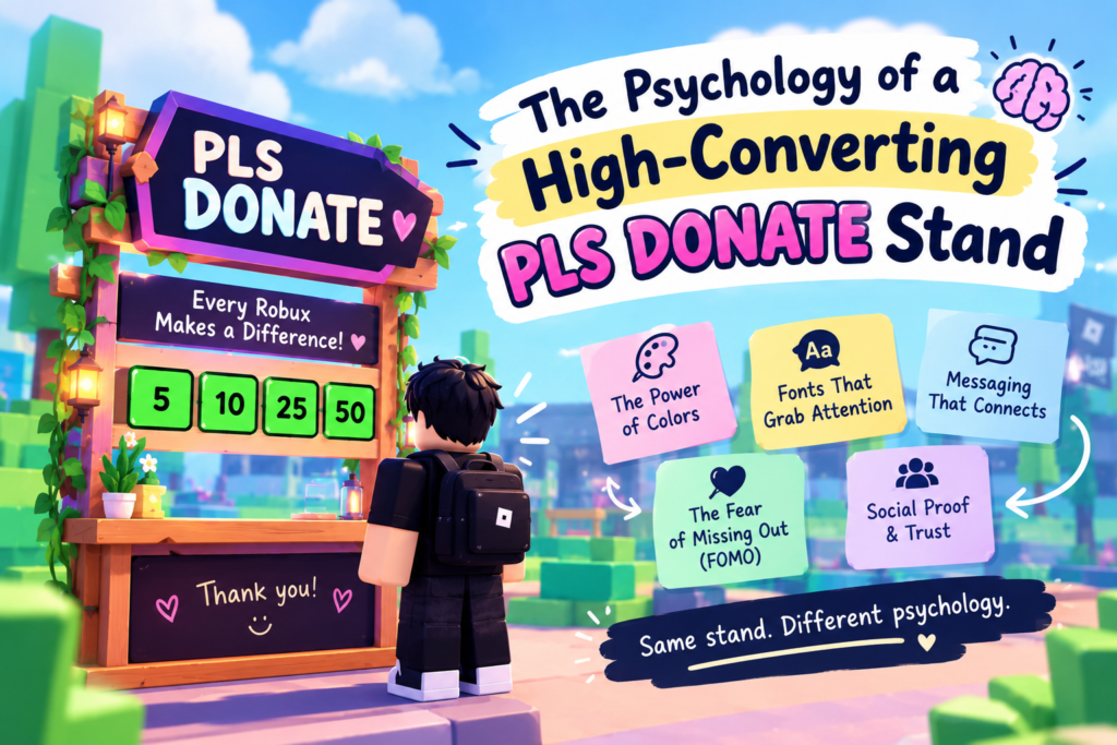
The Psychology of a High-Converting PLS DONATE Stand: Colors, Fonts & Donation Triggers
Introduction: Why Do Some PLS DONATE Stands Get More Donations Than Others?
Two players set up PLS DONATE stands side by side. One sits AFK with a gray default stand and “pls donate I’m poor.” The other has colorful text, a clear donation goal, and a funny message that makes people stop and read.
Both players want Robux, but their stands give visitors very different reasons to pay attention.
The second stand might attract more people simply because it looks interesting, feels welcoming, or gives players something to interact with. The difference isn’t luck; it’s psychology.
In this guide, we’ll look at how colors, fonts, donation goals, and stand messages can affect player behavior. You’ll also get copy-and-paste ideas and simple ways to test what works for your own booth.
One thing to keep in mind: no font, color, or message guarantees donations. These are ideas worth testing, not magic tricks.
Want to give your booth a more polished look? Try our PLS DONATE Text Generator to create styled text for your stand.
What Makes a Roblox Player Stop at a Donation Stand?
PLS DONATE servers can get crowded, and players often pass dozens of booths without giving them much attention. If you want someone to notice yours, you need a reason for them to pause.
That reason could be a funny message, an interesting color combination, a creative theme, or an offer that invites people to join in.
For example, compare these two messages:
- “pls donate”
- “Rating avatars today! Come get your score out of 10.”
The first tells people what you want. The second gives them something to do, even if they aren’t planning to donate.
That small difference matters. Before someone considers donating, they need to notice your booth and have a reason to engage with it. A good stand makes both steps easier.
The Psychology Behind a Stand That Gets Noticed
There isn’t one secret formula for earning Robux, but a few familiar psychological principles can help you understand why some booth designs attract more attention than others.
1. Reciprocity: Give People a Reason to Engage
People often appreciate it when someone does something nice for them. In return, they may feel more willing to do something nice themselves.
You can use this idea by making your booth entertaining instead of only asking for donations.
Try offering something simple:
- Rate someone’s avatar out of 10.
- Tell a joke or ask a trivia question.
- Give players a genuine compliment.
- Play a quick round of Rock Paper Scissors.
- Ask people to share their favorite anime or game.
For example, your stand could say:
“Tell me your favorite anime and I’ll rate your taste /10!”
Players now have a reason to stop and talk. Some may choose to donate afterwards, but the main goal is to create a fun interaction rather than make every conversation feel like a sales pitch.
2. Social Proof: People Notice an Active Booth
A booth with an active player, a few conversations, and genuine thank-you messages can feel more inviting than one where nobody seems to be around.
When players see others interacting with your stand, they may become curious about what’s happening.
You can encourage that naturally by:
- Thanking people when they donate.
- Keeping the conversation friendly.
- Celebrating donations without spamming the chat.
- Showing your top donors if your booth setup supports it.
- Staying involved instead of remaining AFK the entire time.
Don’t fake donations or invent a crowd. A little genuine activity is better than trying too hard to make your booth look popular.
3. Clear Goals: Show People What You’re Saving For
“Pls donate I’m poor” gives no context. It doesn’t tell visitors much about what you’re trying to achieve. A specific, measurable goal always makes sense.
For example, you’re saying:
“Saving for my dream item! 140/500 R$”
Now players can see your target and how much progress you’ve made. Someone who likes your goal might enjoy helping you get closer to it.
A progress tracker also makes it easier for visitors to understand whether a small donation would make a difference.
Keep your goal realistic enough to feel meaningful. You can always update it when you reach your target.
4. Visual Contrast and Humor: Give Your Booth Some Personality (The Von Restorff Effect)
When many stands look similar, a booth with a different color scheme or an unexpected message can catch someone’s eye.
This is related to the Von Restorff effect, the idea that something distinctive may be easier to remember than things that look alike.
You don’t need to cover your booth in symbols to make it memorable. A clear headline and one clever idea may be enough.
Try messages such as:
- “Don’t donate to me. Donate to the guy next door.”
- “Official tax collector. Your Robux, please.”
- “My jokes are free. Donations are optional.”
- “One Robux closer to my very questionable goals.”
A little humor gives your stand character. Pair it with readable text and colors that stand out from the surroundings.
5. Make Donating Easy
Even a player who likes your booth may leave if the available donation amounts don’t suit them.
If you only have 5 R$ and 10,000 R$ buttons, you lose both the casual tipper and the whale.
If possible, offer a range of prices that makes sense for your goals and audience.
For example:
2 | 5 | 10 | 20 | 50 | 100 Robux
Arrange the buttons neatly so players can quickly find an amount they are comfortable with. The exact prices depend on the game passes you’ve created and the options available to you.
Simple idea: Don’t pressure anyone to spend more than they want.
Which Stand Colors Catch Players’ Attention?
Color can help your booth stand out, but there isn’t one perfect color for every player or server. What matters most is whether your text is easy to read and your design looks different enough to notice.
Here are a few combinations worth trying:
- Neon cyan and black: A bright, gaming-inspired look.
- Pink and white: A cute, playful style that works well with pastel themes.
- Yellow and dark gray: Strong contrast that can make a headline easier to spot.
- Red and black: A bold look for dramatic or edgy booths.
- Purple and silver: A magical or premium-style theme.
Test a bright, high-contrast scheme against your current one and see which stops more players.
Bold vs. Thin Fonts: Which Text Is Easier to Notice?
If your stand’s main message is difficult to read, players may walk past before they understand what you’re offering.
Bold text is often a good choice for the main headline because its thicker strokes can remain easier to recognize at a distance. Thin or highly decorative lettering may look attractive up close but become difficult to read from farther away.
Try a useful approach to give each text style a job:
- Main headline: Bold, clear, and easy to notice.
- Donation goal: Simple text that players can understand quickly.
- Extra details: Smaller or more decorative lettering, as long as it remains readable.
For example, make “RATING AVATARS /10” the main focus, then put your smaller goal underneath it.
Don’t make every line bold, oversized, or heavily decorated. When everything competes for attention, it’s harder to tell where someone should look first.
How Fancy Text Can Make Your PLS DONATE STAND Stand Out
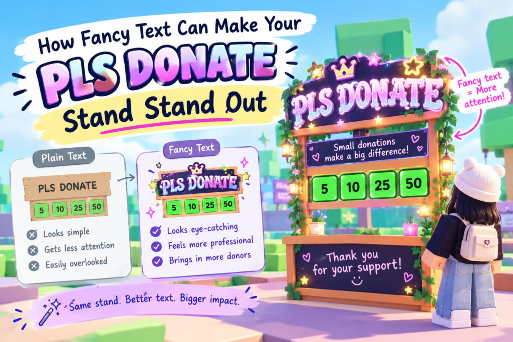
Fancy Unicode fonts (𝗯𝗼𝗹𝗱, 𝓬𝓾𝓻𝓼𝓲𝓿𝓮, 𝕲𝖔𝖙𝖍𝖎𝖈) plus rich-text color make your stand look designed, nFancy text can give a basic booth a more customized look without requiring you to design everything from scratch.
Unicode styles such as these can help create different moods:
- Bold: 𝗗𝗢𝗡𝗔𝗧𝗘 𝗛𝗘𝗥𝗘
- Cursive: 𝓓𝓸𝓷𝓪𝓽𝓮 𝓱𝓮𝓻𝓮
- Gothic: 𝕯𝖔𝖓𝖆𝖙𝖊 𝖍𝖊𝖗𝖊
- Monospace:
𝙳𝚘𝚗𝚊𝚝𝚎 𝚑𝚎𝚛𝚎
You can use a styled name, a colorful headline, or a few symbols to give your stand a recognizable theme.
For example:
★ 𝗥𝗔𝗧𝗜𝗡𝗚 𝗔𝗩𝗔𝗧𝗔𝗥𝗦 ★
Or:
꧁ 𝕯𝖗𝖊𝖆𝖒 𝕲𝖔𝖆𝖑 ꧂
Keep in mind that fancy Unicode characters aren’t the same as installing a font. Some characters may look different across devices or may not display properly in every game field. Test your text in PLS DONATE before settling on a design.
You can create and copy different styles with our PLS DONATE Text Generator.
The Science of a Good Donation Message: Short, Funny, or Emotional?
Your message doesn’t need to tell your entire story. Most players won’t spend long reading a booth, so a short line with one clear idea is a sensible place to start.
Here are three angles to experiment with.
Funny messages
Humor can make a stand feel less ordinary and give players something to remember.
Examples:
- “Donate, or the joke stays this bad.”
- “My Robux balance is fighting for its life.”
- “Certified broke. Uncertified comedian.”
Personal or relatable messages
A genuine goal can help visitors understand why you’re asking for donations.
Examples:
- “Saving for my first limited. Any help is appreciated!”
- “Working toward my dream avatar, one Robux at a time.”
- “Trying to reach my first 200 R$ goal!”
Only use a goal that reflects what you’re actually saving for.
Curious or interactive messages
These messages invite players to participate instead of simply reading a request.
Examples:
- “Guess my avatar’s age!”
- “Rate my outfit out of 10.”
- “Pick a number, and I’ll tell you a random fact.”
Which style works best? It depends on your audience, your booth theme, and how you interact with players.
Avoid long, pleading messages — they read as desperate and get scrolled past. Pick one angle, keep it punchy.
Do Donation Goals Make Players More Likely to Donate?
A visible goal can give people a clearer reason to support you.
Compare these two messages:
- “Please donate!”
- “Saving for my dream item — 140/500 R$.”
The second explains what you’re working toward and shows your progress. Players can understand your target without needing to ask.
As you get closer to the goal, some visitors may find it more appealing to help you finish. This is sometimes associated with the goal-gradient effect: people can become more motivated as a goal gets closer.
However, a progress counter alone won’t convince everyone to donate. Your goal should be genuine, easy to understand, and relevant to what you’re doing.
Update the counter when your progress changes, and celebrate when you reach your target. Then set a new goal if you have another one in mind.
How Small Donation Targets Can Encourage First-Time Donors
A huge target can feel distant, especially when your current progress is very low.
For example, “Road to 1,000,000 R$” might be exciting as a long-term dream, but it doesn’t show a nearby milestone a visitor could help you reach.
A smaller goal gives people something more immediate to work toward with you.
You could try:
- “First goal: 50 R$!”
- “Only 20 R$ left until my next milestone.”
- “Help me reach 100 R$ today.”
Small goals aren’t guaranteed to bring in more donations, but they can make your progress easier to understand.
You can also use milestones. Start with a manageable target, celebrate when you reach it, and then share what you’re saving for next. That way, your stand has a clear story instead of one enormous number that never seems to change.
Humor, Curiosity, and Relatability: Which Message Style Works Best?
Honestly, it depends on your audience and vibe. Different messages appeal to different people, and your own personality may matter as much as the wording.
Here’s a simple way to compare them:
| Message style | Why it might work | Example |
|---|---|---|
| Humor | Makes the booth feel entertaining | “My jokes are free. Robux are not.” |
| Curiosity | Gives players a reason to stop and ask questions | “Guess my favorite game!” |
| Personal goal | Explains what you’re working toward | “Saving for my dream avatar — 140/500 R$.” |
| Interaction | Gives visitors something to do | “Avatar ratings: open for business!” |
You can combine styles without making the message too long. For example, use a funny headline, a small donation goal, and an invitation to interact.
Try one combination for a while and see whether people engage with it. If it doesn’t suit your audience, change it.
Put it into action with 30 creative stand ideas to theme your high-converting stand.
Does a Clean Stand Design Beat a Crowded One?
Usually, yes. A clean design is often easier to understand than a booth filled with tiny text, decorative symbols, and several competing messages.
Think about how someone sees your stand while moving through a server. They may only glance at it for a second. If they have to work out which line matters, your main message can get lost.
Start with three essentials:
- A clear headline: Tell visitors what your booth is about.
- A visible goal: Show what you’re saving for, if you have a goal.
- Organized buttons: Make the available donation amounts easy to find.
You can still use fancy lettering, emojis, and decorative borders. Just make sure they support the message rather than bury it.
A simple, well-organized booth can feel more inviting than a complicated design that tries to say everything at once.
Copy-and-Paste Donation Messages to Test on Your Stand
Need a few ideas to get started? Try one of these and adjust it to fit your personality.
Funny
- 😂 Donate or the joke stays this bad.
- 💀 Official Robux tax collector. Pay up!
- 🙃 Don’t donate to me. Help the guy next door.
Goal-based
- 📈 Saving for my dream item — 140/500 R$!
- 🎯 One step closer to my avatar goal.
- 🥹 Working toward my first limited. Thanks for any support!
Interactive
- ⭐ Rating avatars out of 10. Come say hi!
- 🎮 Guess my favorite game!
- 🎉 Stop by for a joke and a quick chat.
Friendly
- 🤍 Every little bit helps. Thanks for stopping by!
- ✨ Saving up slowly, one Robux at a time.
- 💖 Thanks for visiting my booth, whether you donate or not!
You can style these messages with bold or Gothic Unicode text using our PLS DONATE Text Generator.
How to A/B Test Your Stand Without Guessing
If you change your colors, text, buttons, and theme all at once, you won’t know which change made a difference.
Instead, try a simple comparison.
Step 1: Choose one thing to change.
Start with your headline. Keep the rest of your booth the same.
Step 2: Try two versions.
For example:
- Version A: “pls donate”
- Version B: “Rating avatars /10 — saving for 200 R$!”
Step 3: Give each version a fair chance.
Try them during comparable play sessions. Server activity and the people you meet can vary, so one short session may not tell you much.
Step 4: Keep track of what happens.
Note how many people stop to talk, how many interactions you get, and how many donations you receive. Looking at more than donations alone can help you understand whether a message is attracting attention.
Step 5: Repeat with another change.
Once you’ve compared the headlines, test your colors, font style, or button arrangement.
You don’t need complicated analytics. A few notes can help you spot patterns and make better decisions over time.
Common Stand Design Mistakes That May Cost You Donations
Even a creative booth can be difficult to notice if a few basic details are missing.
Here are some things to watch out for:
- Using only default text: Your booth may blend into the others. Try a clearer headline or a more distinctive color scheme.
- Making a vague request: Explain your goal or give visitors a reason to interact.
- Staying AFK all the time: You miss opportunities to greet players and build conversations.
- Offering awkward price options: A very large gap between buttons may leave visitors without an amount they want to give.
- Overdecorating the booth: Too many symbols, colors, and lines can make your main message difficult to read.
- Setting an unclear or distant goal: Share a specific target or break a long-term goal into milestones.
- Ignoring donors: A sincere thank-you makes the interaction feel more personal.
- Using unreadable fancy text: A stylish message isn’t useful if visitors can’t understand it.
You don’t have to fix everything in one go. Start with the problem that’s most obvious and see whether the change improves your booth.
Build Your Own Stand: A Practical High-Converting Layout
Let’s put these ideas together into a booth you can customize.
1. Start with a strong headline
Choose one main message that people can understand quickly.
Examples:
- “𝗥𝗔𝗧𝗜𝗡𝗚 𝗔𝗩𝗔𝗧𝗔𝗥𝗦 /𝟭𝟬”
- “★ HELP ME REACH MY GOAL ★”
- “FREE JOKES — DONATIONS OPTIONAL”
2. Add a realistic goal
If you’re saving for something, make it clear.
Example:
“Dream avatar fund: 40/200 R$”
Update the number as your progress changes.
3. Organize your donation buttons
Offer a sensible range of prices, where available, rather than making every option a large jump.
For example:
2 | 5 | 10 | 20 | 50 | 100 R$
Choose amounts that suit your goal and the game passes available on your account.
4. Give the booth a consistent theme
Match your colors, text style, and avatar to one idea. A pastel booth, a dark Gothic booth, and a funny meme booth can all work as creative concepts.
The important thing is to make the design feel intentional.
5. Stay involved
Say hello to people who stop by, join conversations, and thank anyone who donates. You don’t have to pressure visitors or constantly repeat your request.
A booth that feels friendly gives people more reason to spend time there.
The Ultimate High-Converting Formula (Comparison Table)
| Element | What Low-Converting Stands Do | What High-Converting Stands Do | What to Test |
|---|---|---|---|
| Main message | “Please donate I’m poor” with no context | A clear goal or interactive hook “Rating your avatar /10! (Goal: 45/200)” | Funny vs. interactive vs. emotional hook |
| Player activity | Staying AFK for long periods | Greeting by name, dancing, and joining conversations | Active sessions vs. passive sessions |
| Donation buttons | Random, gapped pricing (5, 1000) | A range of available prices. Smooth incremental (2, 5, 10, 20, 50, 100) | Different price ranges |
| Visual design | Default gray stand, plain text | Colored rich text, fancy fonts, readable styling | Plain vs. colored/styled text |
| Colors | Low-contrast or default | Bright, high-contrast | Different high-contrast palettes. Warm vs. cool vs. neon |
| Fonts | Thin or difficult-to-read lettering | Bold, readable text for the main line | Bold vs. thin for the main line |
| Goal | No goal or an unclear target | A specific, genuine milestone | Goal vs. no goal; big vs. small target |
| Message length | Long, Several lines of pleading text | One short message with a clear point | Short vs. longer copy. (Humor vs. emotion vs. curiosity) |
| Social interaction | Silent, No response to visitors | Celebrates donations loudly, shows top donors | Different ways of engaging |
| Reciprocity | Asks, gives nothing | Offers jokes, ratings, games first | No offer vs. value-first offer |
| Booth theme | Several unrelated styles mixed together | Colors and text that fit one concept | Different consistent themes |
These are ideas to experiment with — not a guarantee. Test one at a time and keep what works for your servers.
Frequently Asked Questions
How do you get a lot of Robux in PLS DONATE?
Start by making your booth easy to notice and understand. Use a clear message, readable text, a genuine goal if you have one, and a sensible range of donation buttons. Staying active and interacting with visitors can also make your booth more welcoming. Results vary, so experiment with different setups.
How do I create my stand in PLS DONATE?
Claim a stand in-game, set up your game passes (your “donation buttons”), customize the stand’s text with rich text/color, and add a theme. Then apply the psychology principles here.
How do I do PLS DONATE in Roblox?
Join the PLS DONATE game, claim a booth, create game passes at your chosen prices (those become donation buttons), and style your stand to attract donors.
What’s the best message for a PLS DONATE stand?
Choose a short message that fits your personality. A funny line, a genuine saving goal, or an interactive offer can all be good starting points. For example, “Rating avatars /10!” gives people a reason to interact, while “Saving for my dream item” explains your goal.
Do colors and fonts really affect donations?
They can affect how your booth looks and whether people notice your message, but they don’t guarantee donations. Good contrast and readable lettering make your sign easier to understand. Testing different styles is the best way to see what suits your booth.
How do I make my stand stand out?
Give it a clear theme, choose readable colors, and use one memorable headline. Add a genuine goal or an interactive idea if it suits you. You can also use styled Unicode text to customize your booth, provided the characters display correctly in the game.
Final Verdict: What Makes a Donation Stand Worth Stopping For?
A high-converting PLS DONATE stand isn’t about begging — it’s about psychology.
Start with readable text and a color scheme that stands out. Give your booth a clear purpose, try a message that matches your personality, and make the available donation options easy to understand. If someone stops by, a friendly conversation can make the experience more enjoyable for both of you.
Most importantly, don’t assume that one design will work forever—or that a particular font or color will automatically earn more Robux. Try a few ideas, pay attention to how players respond, and make small changes as you go.
Ready to give your booth a fresh look? Use our PLS DONATE Text Generator to create copy-and-paste text styles and find a look that feels right for your stand.