
The Role of Fonts in Your Brand Identity: How to Choose the Right Typography
Introduction
Before anyone reads a single word of your brand’s message, your font has already spoken to them.
Typography is one of the most powerful and most overlooked parts of brand identity. The right font makes a brand feel premium, modern, playful, or trustworthy.
For example, a serif font can give a business a classic feel, while a clean sans-serif can make it look modern and approachable.
Your typography should match your brand, what you sell, and appeal to your audience. The fonts you use on your logo, website, packaging, and social media help people understand what kind of brand they’re looking at.
Our guide explains how fonts shape brand perception, how to choose the right typography for your brand, and the mistakes that may weaken brand identity.
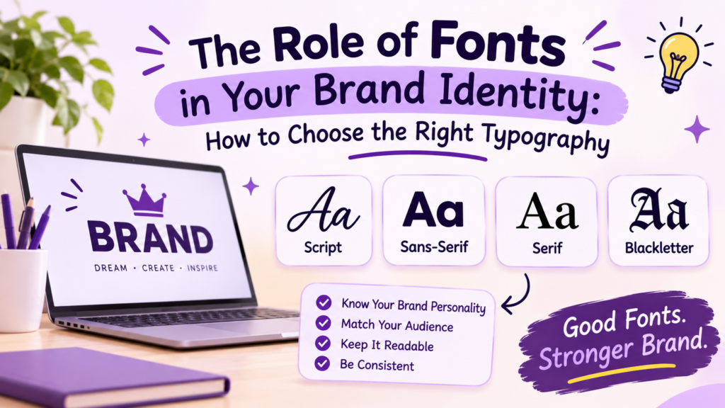
Why Do Fonts Matter in Brand Identity?
Typography is more than a design choice. It helps communicate your brand’s personality without using extra words.
How Typography Shapes First Impressions
People often form an impression before they read a message. A thin, elegant font may feel refined, while thick, playful lettering can seem energetic and bold.
Your font sets the emotional tone; it’s the “voice” of your brand in visual form. When it matches your message, the whole experience feels more natural and connected.
What Your Font Choice Says About Your Brand
Different font styles can create different impressions. For example, serif fonts often feel traditional, sans-serif fonts tend to look modern, whereas flowing scripts suggest creativity and warmth.
Your font choice signals what kind of brand you are, often before your logo or words register. Choose one that matches the message you want to send.
How Different Font Styles Influence Brand Personality
Each font category has its own visual character. Understanding these differences can help you narrow down your options.
Here’s the quick overview:
| Font style | What it looks like | Where it may work well | Examples |
|---|---|---|---|
| Serif | Letters have small finishing strokes | Editorial brands, boutiques, formal businesses | Playfair Display, Garamond |
| Sans-serif | Clean letters without finishing strokes | Websites, technology brands, modern businesses | Inter, Montserrat, Helvetica |
| Script | Letters resemble handwriting | Invitations, beauty brands, handmade products | Dancing Script, Pacifico |
| Display | Distinctive, decorative lettering | Posters, gaming brands, bold headlines | Bebas Neue, Lobster |
| Monospaced | Each character occupies the same width | Coding tools, developer products, technical designs | Courier, JetBrains Mono |
Here is the detailed explanation of the fonts you may need to make your brand stand out:
Serif Fonts: Traditional, Elegant, and Refined
Serif fonts have small finishing strokes at the ends of some letters. They’re often used by brands that want a classic, established, or sophisticated look. They read as timeless and trustworthy.
You’ll commonly see them in publishing, fashion, luxury branding, and editorial design.
Examples: Times New Roman, Garamond, and Playfair Display.
Sans-Serif Fonts: Clean, Modern, and Approachable
Sans-serif fonts don’t have those finishing strokes. Their simple shapes can make designs feel clean, current, and easy to navigate.
They’re popular for websites, technology companies, startups, and brands that want a fresh visual style.
Examples: Helvetica, Inter, and Montserrat.
Script Fonts: Personal, Creative, and Expressive
Script fonts resemble handwriting or lettering created with a pen or brush. Depending on the style, they can feel elegant, friendly, romantic, or artistic.
They’re useful for wedding invitations, beauty brands, boutiques, and creative projects. However, highly decorative scripts can be difficult to read in long paragraphs, so they’re usually better for short phrases or headings.
Examples: Pacifico and Dancing Script.
Script fonts mimic handwriting; personal, artistic, and warm. (Curious how script compares to true calligraphy? See our guide on cursive vs calligraphy fonts.)
Display Fonts: Bold, Playful, and Attention-Grabbing
Display fonts are designed to stand out. They may have unusual shapes, strong strokes, or decorative details.
These fonts work well for logos, posters, headlines, gaming brands, and entertainment projects. Their strong personality can make a design memorable, but they aren’t always suitable for body text.
Examples: Bebas Neue and Lobster.
Monospaced Fonts: Technical and Structured
Monospaced fonts give each character the same horizontal space. This creates a uniform appearance often associated with coding, digital tools, and technical interfaces.
They’re a natural fit for developer-focused brands or designs that use a minimalist, code-inspired style.
Examples: Courier and JetBrains Mono.
How to Choose the Right Font for Your Brand?
Before browsing hundreds of fonts, think about three things: your products, your customers, and where your typography will appear.
Start With the Products You Sell
A font should match what your business offers. A playful font could suit a shop selling colorful stationery, while a restrained design might suit a company selling premium watches.
You don’t have to follow the usual style for your industry. In fact, a different approach can help your brand stand out. Just make sure the choice feels intentional rather than random.
Think About Your Customers
Consider who will see your brand and what they need from it. A font that works for a fashion campaign may not be suitable for a financial service website.
If your audience mainly visits through mobile phones, test your font on a small screen. Thin strokes, tightly spaced letters, and decorative shapes can become difficult to read when reduced in size.
Match Your Typography to Your Industry
Some font styles are common in particular industries. Finance and publishing often use traditional typography, technology brands frequently choose clean sans-serif fonts, and children’s products may use more playful lettering.
You don’t have to follow every industry convention. A different approach can help your brand stand out, provided the typography still suits your message and audience.
Check Readability on Different Screen Sizes
A font that looks good in a large logo may not work for body text, buttons, or product descriptions.
Try it in a few real situations before committing to it. Put it in your website header, write a short paragraph with it, and see how it looks on a social media graphic. This is a more useful test than judging the font from its preview alone.
Choose Fonts That Work Together
Many brands use two main fonts: one for headings and another for body text. This creates a clear visual hierarchy without making the design feel busy.
Your heading font can have more personality, while your body font should remain comfortable to read. The two should look different enough to serve separate purposes but still feel like part of the same brand.
How Typography Builds Brand Recognition?
Using typography consistently helps people connect your visual style with your business over time.
Why Consistent Fonts Make a Brand More Memorable
When people repeatedly see the same typography in your content, it can become part of how they recognize your brand.
Think of familiar wordmarks such as Coca-Cola’s flowing script or Google’s clean lettering. Their identities involve more than fonts alone, but typography plays an important role in their visual recognition.
The same principle applies to smaller businesses: a consistent, recognizable style is more useful than constantly switching between unrelated fonts.
Using the Same Typography Across Your Website and Social Media
Your brand should feel connected wherever people encounter it. Use your chosen typography across your website, social media graphics, emails, packaging, and promotional materials.
You can adjust font sizes and layouts for different platforms while keeping the core font choices consistent. This gives your brand flexibility without making each channel look unrelated.
The Role of Fonts in Logos, Headlines, and Marketing Materials
Different parts of your brand serve different purposes:
- Logo: Establishes a recognizable visual identity.
- Headings: Draw attention to important messages.
- Body text: Communicates information clearly.
- Social media graphics: Help your posts maintain a recognizable style.
- Packaging and promotional materials: Carry your visual identity into the physical world.
These elements don’t need to use identical fonts. They should work together to create a consistent overall appearance.
How to Pair Fonts Without Making Your Design Look Messy
Many brands can work well with two fonts: one for headings and another for body text. The heading font gives the design character, while the body font keeps longer text comfortable to read.
Here are a few combinations worth trying:
| Heading font | Body font | Suitable for |
|---|---|---|
| Playfair Display | Lato | Editorial, boutique, and premium-style brands |
| Montserrat | Open Sans | Modern businesses and technology websites |
| Dancing Script | Open Sans | Handmade products, beauty, and creative businesses |
| Poppins | Nunito Sans | Friendly, casual, and playful brands |
These combinations are examples, not guaranteed solutions. Try them with your own colors, logo, and content to see whether they fit.
A simple way to test a pairing is to write the same heading in both fonts. If the two styles compete for attention, try a simpler body font or a less decorative heading. You want the fonts to look related without making everything appear identical.
You can also use different weights of the same font family. For some brands, that is enough to create a clear difference between headings and paragraphs.
Common Font Mistakes That Can Weaken Your Brand Identity
Using too many fonts. If every heading, button, and paragraph uses a different style, the design can feel disconnected. Start with two fonts and add another only if you have a clear reason.
Choosing a font that’s hard to read. A decorative logo may look attractive, but your customers should not have to struggle to read your business name or product details.
Choosing a font just because it’s popular. Trends change. A font that looks fashionable today may not fit your brand a year from now. Choose something that suits your business rather than copying another company’s design.
Using different styles everywhere. Your website, packaging, emails, and social media graphics do not have to be identical, but they should feel as though they belong to the same brand.
How to Use Fonts for Different Types of Brands
Your industry and brand personality can help guide your font choices, but you don’t need to copy what every competitor uses.
Fonts for Luxury and Premium Brands
Refined serif fonts and carefully chosen sans-serif styles can suit premium brands. Generous spacing, simple layouts, and restrained use of decorative details can support this look.
A font alone won’t make a business feel luxurious. The overall design, product quality, messaging, and customer experience also shape that impression.
Fonts for Beauty, Fashion, and Lifestyle Brands
These brands often combine elegant serif or script styles with a clean font for longer text.
A decorative font can bring personality to a logo or heading, while a simpler typeface keeps product details, prices, and website content easy to read.
Fonts for Technology Companies and Startups
Clean sans-serif fonts are a common choice for technology brands because they can work well across websites, apps, and digital products.
Fonts such as Inter and Montserrat are worth exploring if you want a modern look. Choose a style that remains readable in navigation menus, dashboards, buttons, and small interface labels.
Fonts for Gaming and Entertainment Brands
Gaming and entertainment brands often use bold display fonts to create energy and a strong visual identity.
Angular, futuristic, or heavy lettering may suit some games, while rounded or playful fonts may fit casual entertainment brands. Match the font to the experience rather than choosing the most dramatic option available.
Fonts for Friendly, Playful, and Creative Businesses
Rounded sans-serif fonts, expressive display styles, and selected script fonts can help a business feel welcoming or creative.
Fonts such as Poppins and Quicksand are useful starting points for exploring rounded, approachable styles. Check that your final choice still works for longer text and smaller screens.
Should Your Brand Use the Same Fonts Everywhere?
Your main typography should remain recognizable across your website, packaging, emails, and social media. That doesn’t mean every design must look exactly alike.
For example, your website might use one font for headings and another for paragraphs. Your Instagram graphics can use those same fonts while experimenting with layouts, colors, and image styles.
Decorative text can also work for occasional social posts, usernames, or bios. Unicode fancy font style is one option for creating a different look without installing a font file. However, these characters are not the same as changing the actual font in a design program. They may display differently across devices and can be less accessible to some readers.
If you’re styling a social profile, you can try our font generator to create copy-and-paste text styles.
Font Psychology vs. Brand Identity
Here’s a quick reference:
| If your brand should feel… | Consider exploring… |
|---|---|
| Refined or traditional | Serif fonts |
| Clean and modern | Sans-serif fonts |
| Personal or handmade | Script fonts for short text |
| Bold or energetic | Display fonts |
| Technical or code-focused | Monospaced fonts |
Font psychology looks at the impressions different letter styles may create. Brand identity is broader: it includes your typography, colors, logo, imagery, tone of voice, and the way your business presents itself.
A serif font may suggest tradition in one design, for example, but that doesn’t mean every serif logo looks formal or expensive. The same font can feel very different when paired with bright colors, playful illustrations, or minimalist packaging.
Use font associations as a starting point, then judge the result in the context of your actual brand.
Frequently Asked Questions
Why are fonts important for brand identity?
Fonts shape first impressions and carry emotional connections; they signal what kind of brand you are before anyone reads your message. Consistent typography also builds recognition over time.
Which font style is best for a business?
There is no single best font for every business. Serif fonts may suit traditional or editorial brands, sans-serif fonts often work well for modern businesses, and script or display fonts can add personality when used appropriately. Choose based on your audience, message, and readability needs.
How many fonts should a brand use?
Two is the sweet spot: one for headings, one for body text. A third can work for occasional accents, but every font should have a clear purpose. More than that looks cluttered and weakens recognition.
Should your logo and website use the same font?
Not necessarily. Your logo can use a distinctive typeface while your website uses coordinated fonts for headings and paragraphs. The important thing is that the choices work together visually.
Can changing your brand’s font affect how people perceive it?
Yes. A typography change can make a brand appear more modern, traditional, playful, or refined. However, the effect depends on the complete design and how well the new style fits the brand’s audience and message.
Are free fonts suitable for professional branding?
Yes. Many free fonts are suitable for professional websites, logos, and marketing materials. Always check the font’s license to confirm that it permits your intended use, especially for commercial projects.
Can you use fancy fonts in social media branding?
Yes, particularly for short decorative elements, bios, and occasional graphics. For a consistent brand identity, keep your main typography readable and use fancy Unicode text selectively.
Final Thoughts on Choosing Fonts for Your Brand Identity
Choosing brand fonts gets easier when you stop looking for one perfect typeface and start testing how different options work with your business. Try a few styles, compare heading and body fonts, and check them on both desktop and mobile screens.
Most importantly, look at the complete design rather than the font on its own. A good choice should suit your brand, make your content easy to read, and still feel right when you use it across different platforms.